New Website: How It Helps You
November 29, 2018 · NCQA Communications
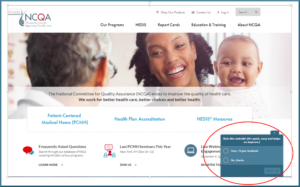
We have redesigned NCQA’s main website—ncqa.org—to give people who care about health care quality important capabilities.
Simpler, Shorter Descriptions
We rewrote descriptions of NCQA’s mission, products and programs to be lighter and tighter. This streamlining helps you “grab and go”—find the facts you want, then move on.
Our new site is 22 to 34 percent more concise than the site it replaced, depending on whether you’re looking at sentence length, paragraph length or words per page.
We improved readability by simplifying text from a university level to a high school level. After all, even people with advanced degrees appreciate an easy read!
As Much (or as Little) Detail as You Want
People who work in health care quality are busy. They don’t always want or need details of all that NCQA can do for them.
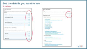
Our site uses “accordion” buttons that collapse or expand pages to reveal only as much detail as users want.
This “see it your way” feature is most useful in areas our site that are both broad and deep, such our description of HEDIS measures.
Filtering on Events You Care About
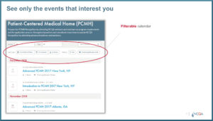
Filters on our events calendar let you see only the activities that interest you. Everything you don’t care about is removed from view.
This ability to see only what interests you is handy for topics such as PCMH training, where many options and variations exist.
Alerts When Something You Care About Changes
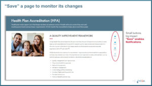
We packed a lot of convenience into the Save button on the right of most pages.
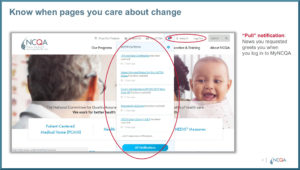
Clicking on the “Save” icon tells NCQA that you want to keep an eye on that page.
When you log into your My.NCQA account, a message alerts you if we have updated a page you have saved. This is called a “pull” notification.
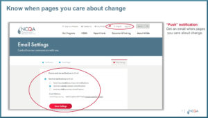
A “push” notification goes one step further. With this option, you ask to receive an email alerting you that we have changed one of your Saved page.
Stronger, More Flexible Search
You don’t need to know our lingo or even know exactly what you’re looking for to find what you want on our site. That’s because we have upgraded our Search function in two important ways.
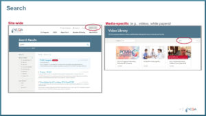
First, we installed site-wide search that lets you access topics using a combination of terms—just like a regular search engine you would use to search the whole Internet.
Second, we installed media-specific search. For example, you can search within our Video Library for videos on certain topics.
How We Ran Our Redesign
As users and proponents of evidence-based medicine, we took a data-driven approach to remaking our website.
We based design decisions on diverse data sources, including:
- More than 2 years of user satisfaction ratings & comments.
- Google Analytics covering more than 6.7 million pageviews.
- Heatmaps on 13 high-traffic pages for 6 months.
- Treejack navigation tests (2 rounds, 6,283 use-cases).
- Surveys and in-depth phone interviews with users.
(Many Quality Matters readers participated. Thank you!)
Our site will continue to evolve. We welcome your feedback and your ideas for other enhancements.
The quickest way to let us know what you think is to complete a user satisfaction survey by clicking on the downward arrow in the lower right corner of any page.
